Do you have a registration form on your website? If you don’t – you should. How else will you be able to update your users about new features of your product, or send them your company’s newsletter?
You may think that the appearance of your registration form and the type of information it requires may not be related to the number of potential users on your website. After all, it only takes two minutes to fill a registration form – so what does it matter whether it’s user-friendly or not? Well, guess what? You’re wrong!
A recent study reveals that over 10% potential users of a website leave an online purchase after encountering the website’s registration form. Think of the huge implications this may have on your business – whether it’s a product or service you’re offering, one-tenth of your potential clients are going to waste, simply because your registration form is too incomprehensible or annoying to fill.
You obviously don’t want that to happen. Let’s look at some things you can do to make sure the maximum amount of people register to your website. The following tips will not only help you in making your registration form clearer and more conspicuous on your website, but may actually lead to people WANTING to register who didn’t think of doing so in the first place.
What’s in it for Them? Tell Your Users Why They Should Register
Just as we advised you in our recent post about newsletters, users may not be interested in subscribing to your website unless it benefits them in some way. To encourage more people to register to your website, you have to clearly state what benefits and extra information they would get as registered users:
- Do they get a monthly newsletter?
- A freebie?
- E-mail updates about new products?
- A discount upon purchasing from your website?
Encourage users actively to join your website by including a clear call to action. Examples for lines to use are: ‘Join Today and Get our Mobile App for Free!’, ‘Sign Up to get a 10% Discount on Your Next Purchase!’, ‘Subscribe to Get Exclusive Updates!’.The better the incentive you offer, the more subscribers you will get.
This registration form includes a clear call to action:
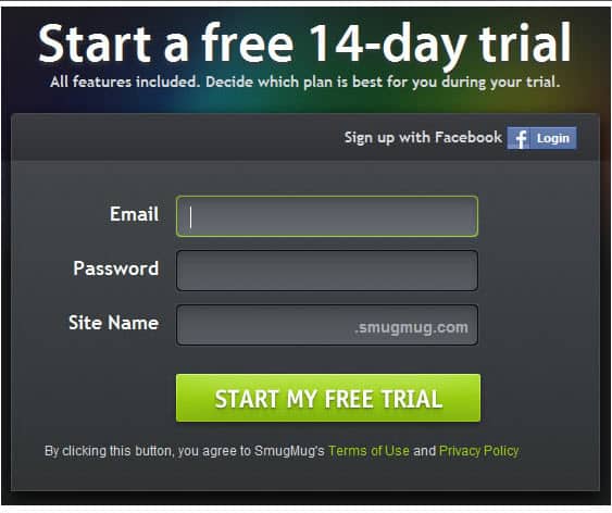
From Smugmug.com
And wouldn’t you like to get a free T-shirt – just for signing up?
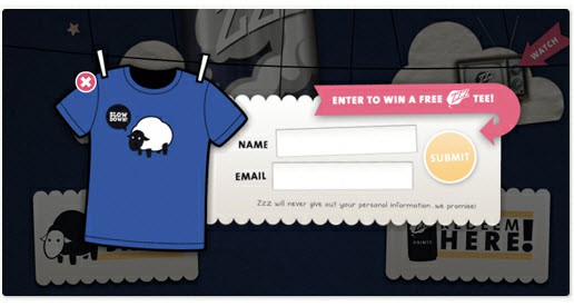
From zzz.drinkzzz.com
Less (Information) is More (Registered Users): Don’t Ask for Unnecessary Details
When considering the fields users need to fill in to register, try sticking only to the absolutely necessary details. Most people do not like leaving too much personal information on the internet – in fact, many avoid registration forms exactly for this reason. For example, unless you want to text registered users, do not ask for their phone number. An e-mail address would suffice.
Think Small – Don’t Let Your Registration Form Exceed One Page
Face it – most people do not browse a website for more than a few seconds before they move on. The attention span of internet users is painfully short. So following the advice above, do not include too many fields/questions on your registration form. Make it short and sweet. If it can fit into a sidebar on your website’s homepage that would be best. But even if more details are necessary, then do your best to keep it under a page long – or else, users facing numerous fields that span several pages will most likely not make the effort of filling them in.
Be Everywhere: Let Potential Subscribers Register from Social Networks, Too
Besides the official website, does your business have a blog, a Facebook page, or an account on Twitter? Make sure your fans and users can register to your website from anywhere. Many social websites allow you to place a signup widget to your website – so users who wouldn’t necessarily reach it otherwise are still able to subscribe elsewhere. Also, registering from a social network has its benefits: it helps you in gathering more useful information about your subscribers. FanBridge, a website that specializes in fan management, offers a service that helps you create signup forms for your website on Facebook and Twitter.
This form lets you sign up on website a through any social network that you choose:

From Sparked.com
Avoid Confusion: Make the Process Logical and Break it Into Clear Steps
First, break the registration process into clear steps. Label them accordingly, with a brightly colored, large-sized font. Also, make sure subscribers don’t get disoriented or impatient: for each step, state how many steps remain (for example ‘step 3 of 5’). Also, you can simply state in words what the next step is going to be (if the user is on the ‘Contact Details’ step, then include a line at the bottom saying ‘Next: Choose a Payment Method’.
An example for a registration form that clearly shows you the steps of the process:
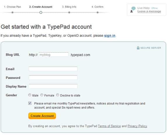
From Typepad.com
Don’t Hide Your Registration Form: Make It Conspicuous & Easily Accessible
As previously said, a random visitor will most likely stay on your website for a very short time. In that short time, make sure this visitor sees your registration form easily. Don’t hide it – make it clearly visible on your homepage. Make sure the registration area on the page is clearly labeled and brightly colored so it pops up easily to the eyes of the beholder. For attention-grabbing purposes, use a 16-18 point font for the labels in the registration area, and place the link to the registration form in a noticeable part of your homepage.
Could this be any more visible? The link to Vimeo’s sign up form is smack in the middle of its homepage:

Be Trustworthy: Provide a Visible Link to Your Security & Privacy Policies
Don’t forget that your potential subscribes need to trust you before the provide you with personal information. Therefore, it is of key importance to provide a link to your security and privacy policies in the registration process. Place the link in a visible spot, preferably at the beginning of the registration process. Accompany it with a line like: ‘Your personal information is safe with us. Click here for details’.
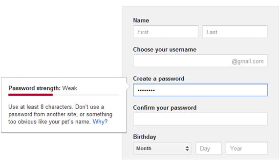
Easy with the Password Requirements: Don’t Make Them Impossible
Subscribers do not usually have an objection to providing a password; however, if password requirements are not easy to follow they may simply bail. Even if they do comply, their password may be hard to remember after following obscure, odd and unnecessary requirements. Instead of listing a long list of ‘No-no’s’ (‘password must be 10 characters long’, ‘you must mix lower case with upper-case letters’, ‘password should include a mixture of letters and numbers’), you can let the users decide for themselves whether they are satisfied with the strength of their password. For example, you can use a password-strength visual meter that indicates the strength of the password – like Google does:
Forgot Your Password? Make Password Recovery Easy
It happens to everyone at some point. We register to so many websites that we may occasionally forget our password to one (or some) of them. If this happens, it is very importance that recovering the password for your website will be an easy process. If subscribers need to face a lengthy, cumbersome process just to get their password back, they may just abandon the site. Do your best to make password recovery easy and instantaneous.
Tell Subscribers Where They Went Wrong: Make Form Errors Clearly Visible
Mistakes can easily occur when filling in registration forms, whether they’re due to typos or a misunderstanding of the filling-in instructions. To avoid wasting time and testing the subscribers’ patience, show them exactly where they went wrong. This can be done by highlighting the field where they made a mistake in a bright color, or by writing next to it that the details weren’t filled it correctly, in a noticeable red font.
A Word from the Experts: Video Guides for Creating Registration Forms
You’ve read all the tips above but you still want a through, step-by–step guide? You can watch this video from Mailchimp, which shows you how to make a sign up form and embed it in your website:
Also, you can watch this short webinar from Convince&Covert, which looks at registration forms on several websites and analyzes their good and bad points:
A Penny for Your Thoughts
As you see, a registration form is an extremely important part of your website. It can help bring in more users – or can send them running elsewhere… Therefore, it is crucial to build and design your registration form cleverly. We hope that this post has given you something to think about.
Have you got more tips on creating good registration forms? Please share them with us. Thanks!
Image by: assbach